27/8/2018 - 01/10/2018 (week 1- week 6)
Alicia Lee Hui Min ( 0331719 )
Advanced Typography
Exercises
LECTURE NOTES
Lecture 1: Introduction to Advanced Typography and Typographical systems.
27/8/2018 (week 1)
We were divided into groups and were each given a system to present , here is the final compilation of all the systems in PDF.
INSTRUCTIONS
Design Layout Systems ( Week 1-2)
27/8/2018 (Week 1)
 |
| Fig1.0 Axial System |
 |
| Fig1.1 Axial System |
 |
| Fig1.2 Radial System |
 |
| Fig1.3 Radial System |
 |
| Fig1.4 Dilatational System |
 |
| Fig1.5 Dilatational System |
 |
| Fig1.6 Random System |
 |
| Fig1.7 Random System |
 |
| Fig1.8 Grid System |
 |
| Fig1.9 Grid System |
 |
| Fig 2.0 Transitional System |
 |
| Fig 2.1 Transitional System |
 |
| Fig 2.2 Modular System |
Fig 4.4 PDF of Final
Type and Play Part 1 ( Week 3 - Week 4)
Since today is a public holiday, we resume to doing the exercise that we were briefed on last week by Mr Vinod. The exercise was to create letters from the photograph we had taken wether it be a man made structure or nature. I decided to use a building that I took a picture of and crop it and use the windows to make the letters.
 |
Fig 5.0 Picture Taken
|
 |
Fig 7.7 Final Piece
|
PDF of Final Piece
FEEDBACK
Week 2
General Feedback: While applying the system effectively is important we shouldn’t forget about having a good composition, communication (readability) and hierarchy. We should also be careful when using colours and they should only be used as a highlight. We were also told that we shouldn’t fill the background with colour as a mean to fill up the space and instead focus on fixing the composition.
Specific Feedback: Some of the compositions were wrong and I needed to change them and also Mr Vinod said that I need to take a break and look back at my composition after that with fresh eyes. He said that my dilatational designs were good.
Week 3
Specific Feedback:When you choose a selected part of the image, of would be necessary to dissect that image in to lines as part of the process. Your process unlike many of the other students seems to have yielded an outcome that is already relatively refined. I would suggest placing your letters on a baseline, to view its x-height, ascended, descender and cap height to check on proportion, consistency and character. Just continue the refinement upon. Remember to ensure some element of the original character (it needn’t be very obvious). Presently there is visibility of its original form to a certain degree already.
REFLECTION
Experience
Week 1; The assignments for this semester looked tougher than the first semester but it also looked interesting. Today we learned about the 8 typographic systems which was really interesting and widen my knowledge on how typography works.Week 2; It was hard to come up with good designs and complete all the systems in one sitting , instead I should look at it with fresh eyes the next time.Week 3; Today was a public holiday therefore there was no class but Mr Vinod did brief us a week before on what to do so we carried on to do the next exercise. Week4; this week's exercise was not as easy as I thought it would be in fact it was very hard and a lot of thought process had to be done in order to come up with a good composition.
Observation
Week 1;I observed that I got myself confused with some of the systems as it was new and took awhile to understand and also some research and references.Week 2;I observed that some of my designs for the typographic systems were wrong and I understood better after Mr Vinod's explanation. I also realised that some of my designs did not apply hierarchy and also I forgot to consider the readability for some of the designs. Week 3; I observed that I should place the letters on a baseline to check the proportions and consistency. Week 4; I observe that it is hard to compose a design whereby both typography and visuals connect.
Findings
Week 1;I've realised that we have actually used the typographic systems last semester just not knowing that what we did was actually a typographic system, we mostly played around with it for the final project last semester.Week 2, I've found out that when designing a poster such as this that we should create a design that allows the viewer to use a bit of their imagination instead of being too straightforward and also that we as designers should prioritise hierarchy and readability.Week 3; At the end I should always remember to keep the letters consistent and in proportion.Week 4, I found it hard to combine images together with words as they would not connect so I have found that I should look at more references and study how they combine visuals and typography together.
FURTHER READING
Exploring Typography Second Edition by Tova Rainbinowitz Deer
27/08/18 - 3/09/18 (Week 1-2)
 |
| Fig 7.0 Front Cover of Book |
I decided to read on legibility and readability, it's one of the most important elements in typography as words are meant to be read. The readability is essential in a design to keep a reader engaged. Legibility refers to the ease with which a reader can recognise and differentiate between letterforms. When letterforms vary too much from their simplest forms, readers may feel confused or frustrated; hence, reducing comprehension. Readability refers to how easily a page of text can be read and navigated.Even if the text is legible, readers may find it difficult to read if a layout is messy or crowded.
Factors that influence legibility is the style of a typeface such as type styles, colour and value, typographic colour and also texture type. Size and shape of the the type is also one of the factors.Background whereby it contrast with the text is also another factor.
On another hand, factors that affect the readability is the typeface selection which can be tough to tackle as there are a lot of typefaces and choosing one that is optimal for that particular design is hard. The next factor is the arrangement of letterforms that is alignment, measure, widows and orphans. Another factor is the use of negative space in a layout such as kerning, word spacing, tracking and letterspacing.
Advertising Design and Typography by Alex W.White
10/09/18 (Week 3 - Week 4)
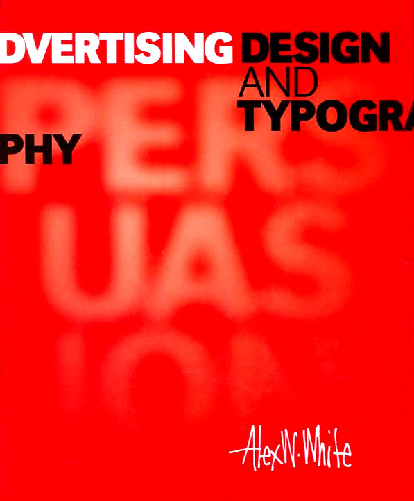 |
| Fig 7.1 Front Cover of Book |
Display type is usually the big type meant to be read first. It is crafted to attract attention and, second only to the image, gives a large degree of "style"to an ad. The one piece of display type that appears everywhere in a campaign is the company's logo. More than any other typographic element, it represents the product in the marketplace. Logo is a Greek for "word". It is a term that is applied to any trademark, though it is properly used only for marks with a written name like Nike but not the tick which is a symbol.
All logos are symbolic and abstract to some degree. Abstract marks must be learned through repeated contact, which is an investment in time and money just for recognition. Smaller, local businesses tend to have less abstract, more literal, marks. Companies whose businesses can't be easily illustrated benefit from more abstract marks, as do conglomerates and global entities.


Comments
Post a Comment